loading
Pure Cane Jaggery
01 / About
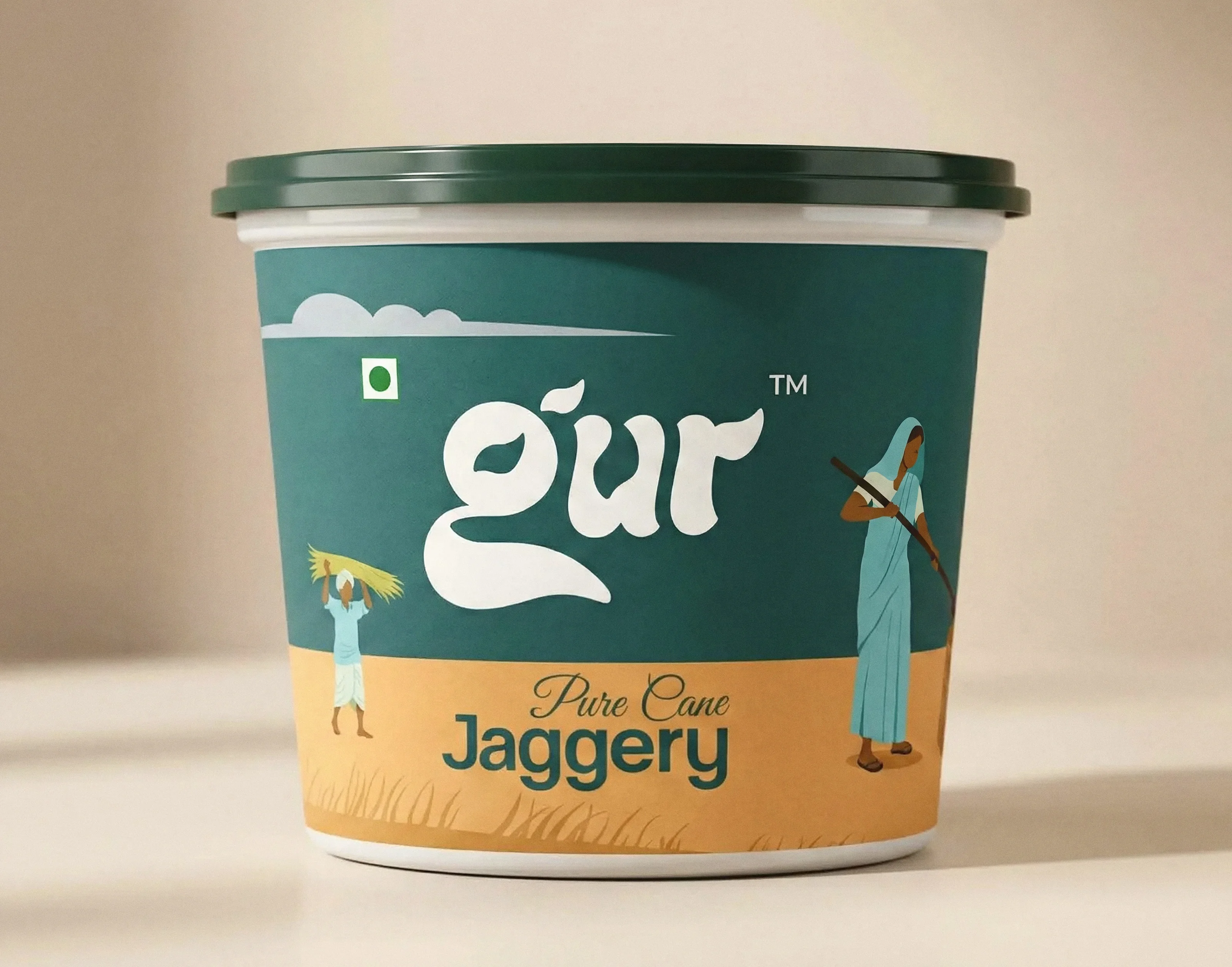
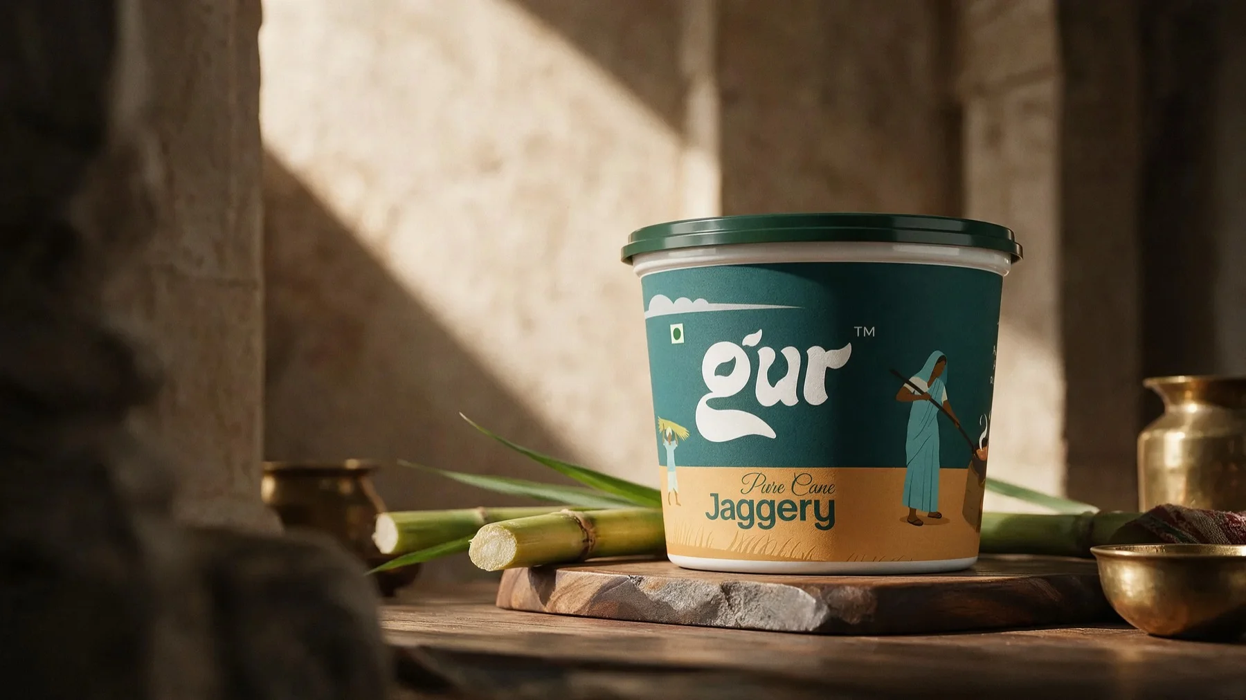
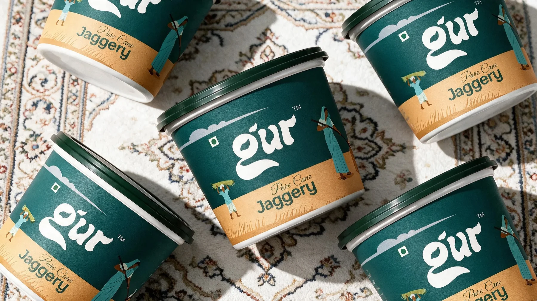
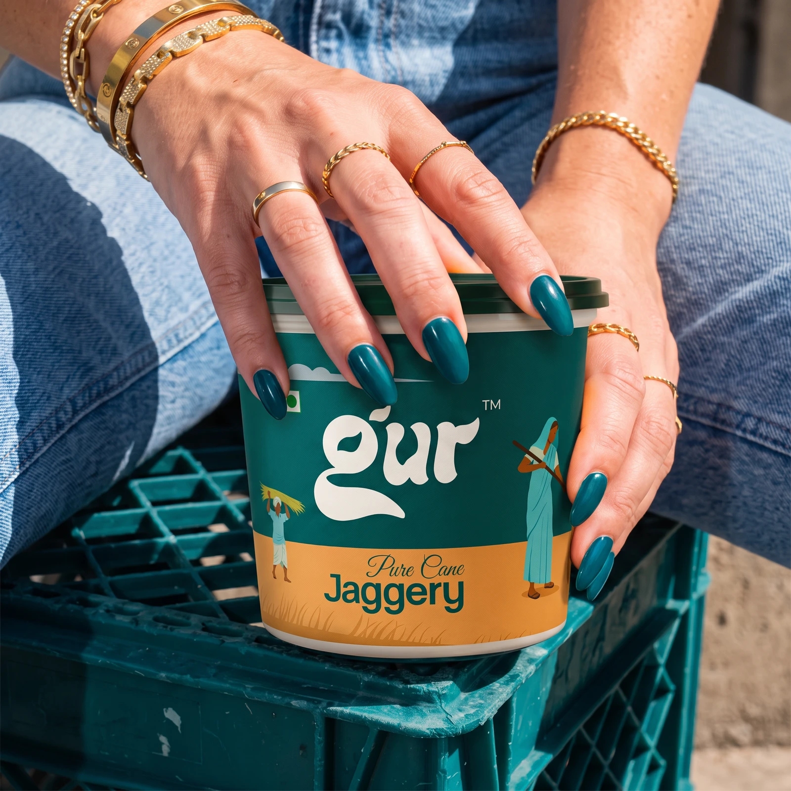
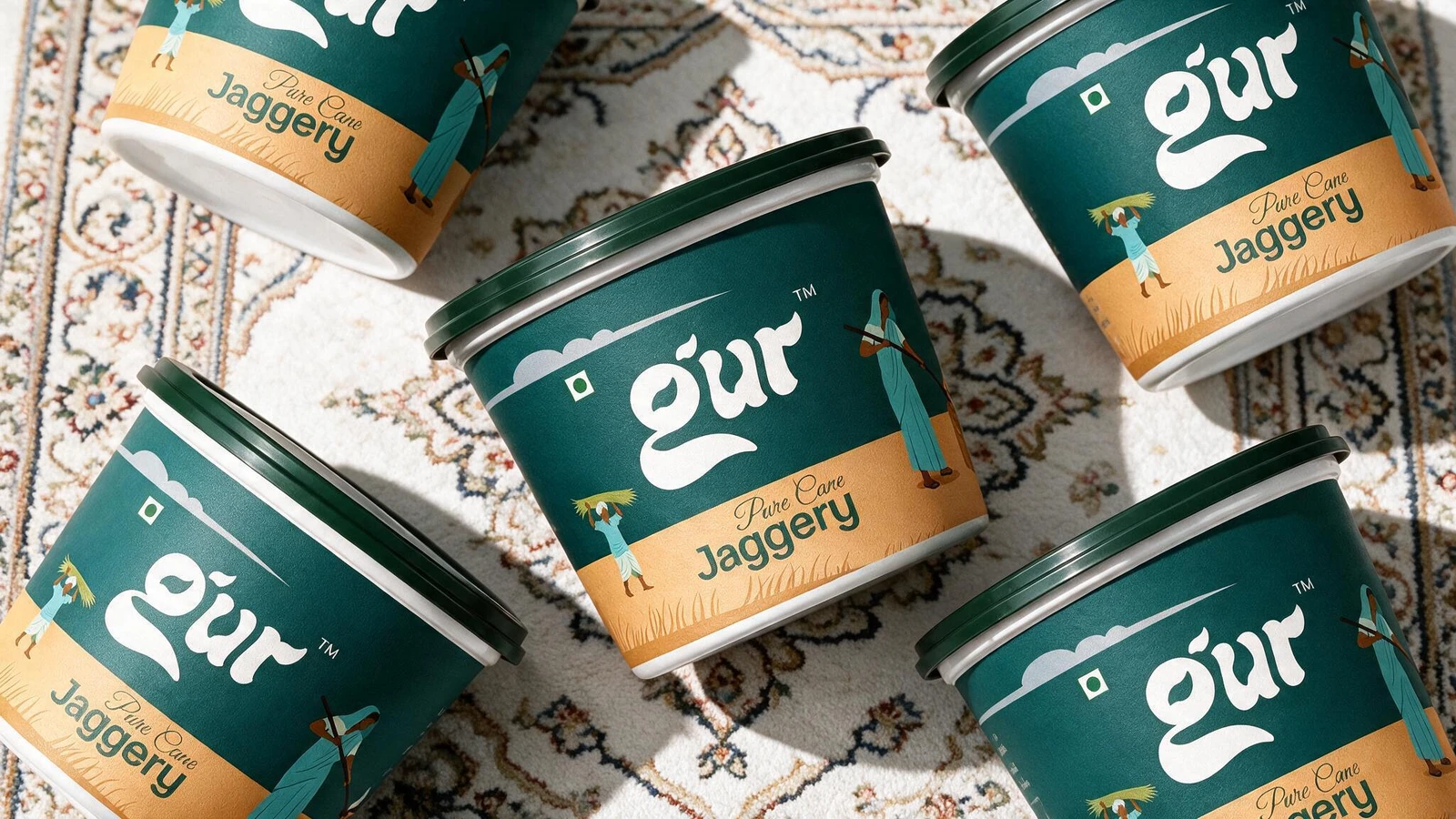
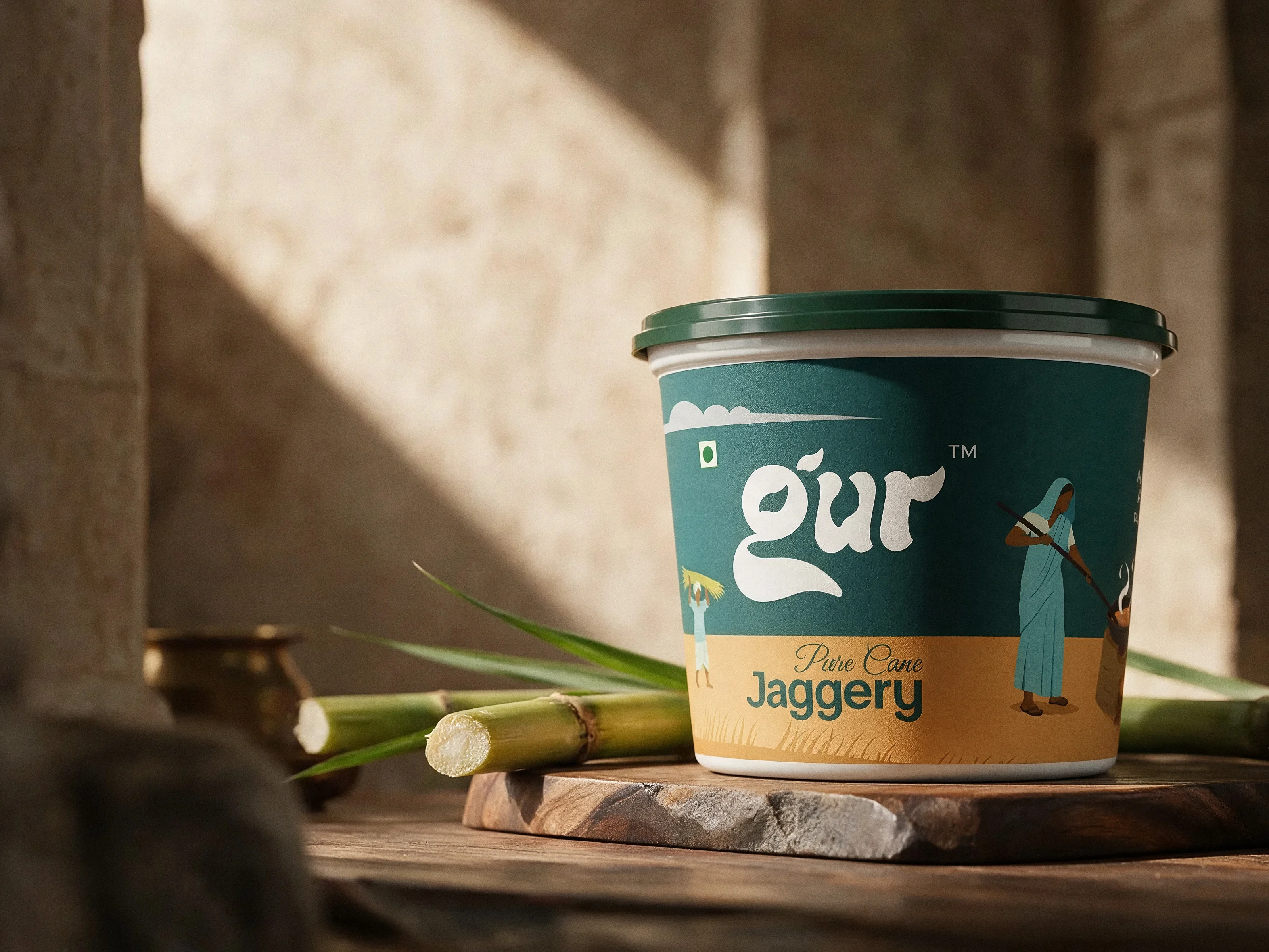
GUR™'s visual identity is rooted in authenticity, a tribute to the quiet rhythm of village life and the timeless craft of making jaggery.
We envisioned a brand that feels warm, honest, and deeply connected to its origins. Inspired by rural landscapes, the identity captures scenes of harvested sugarcane, earthy textures, and the simple, hardworking spirit of the people behind the process. It reflects not just a product, but a way of life: slow, intentional, and grounded.
At the heart of the brand lies the story of transformation, from raw sugarcane to rich, golden jaggery. This journey is expressed through visual elements that feel tactile and real: organic forms, sun-baked tones, and a rawness that celebrates imperfection rather than hiding it.
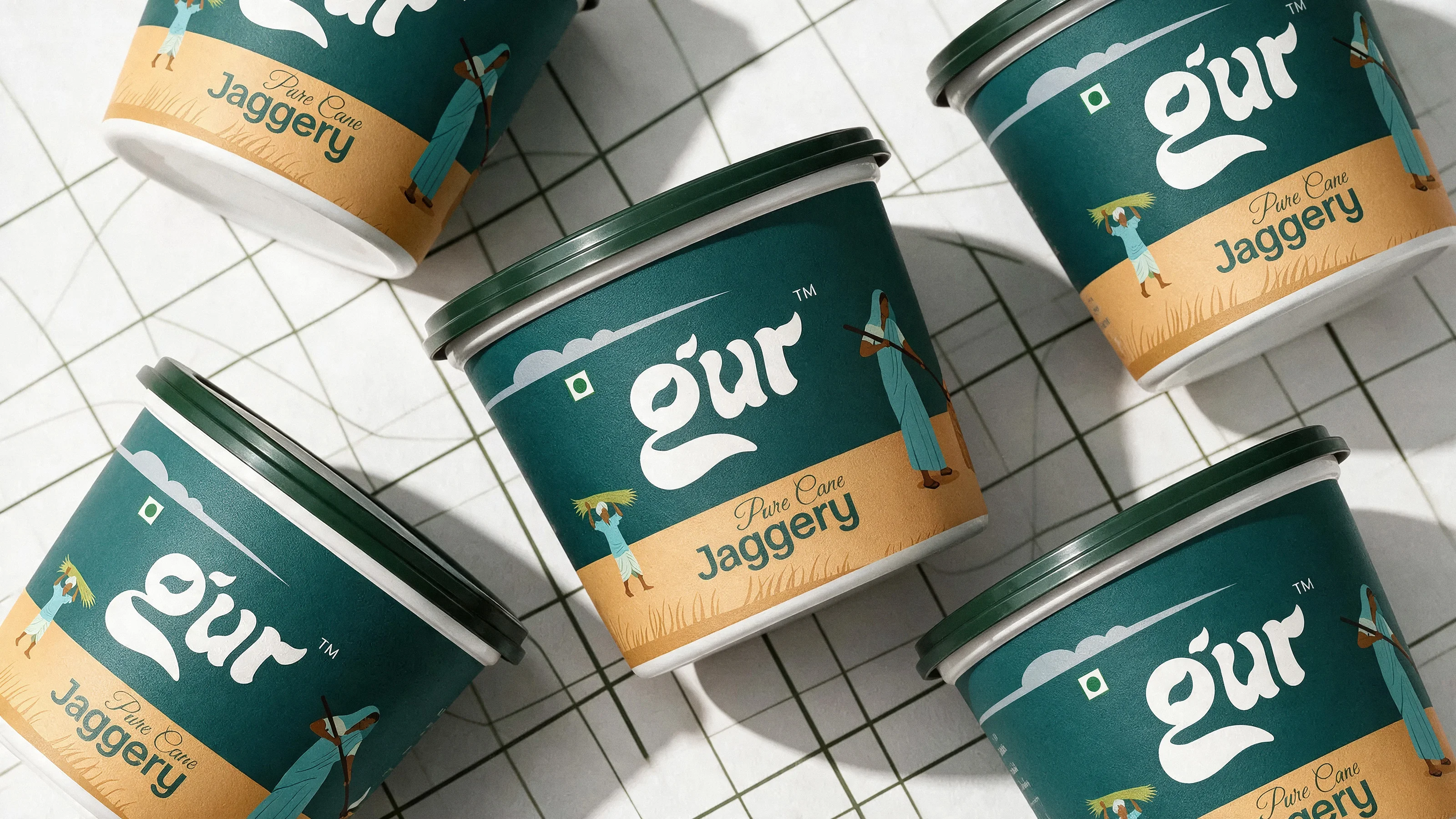
The design balances nostalgia with clarity: traditional inspiration brought into a clean, contemporary structure. It feels familiar yet refined, evoking trust while standing strong on modern shelves.
- Scope
- Brand identity, packaging design
- Deliverables
- Wordmark, label system, pack illustration
- Format
- Tub, pure cane jaggery
- Sector
- Food, pantry staple