loading
Little Hands, Big Imagination
01 / About
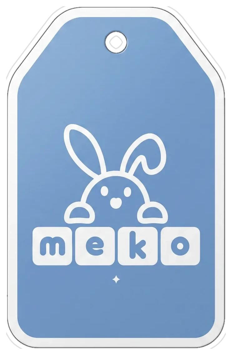
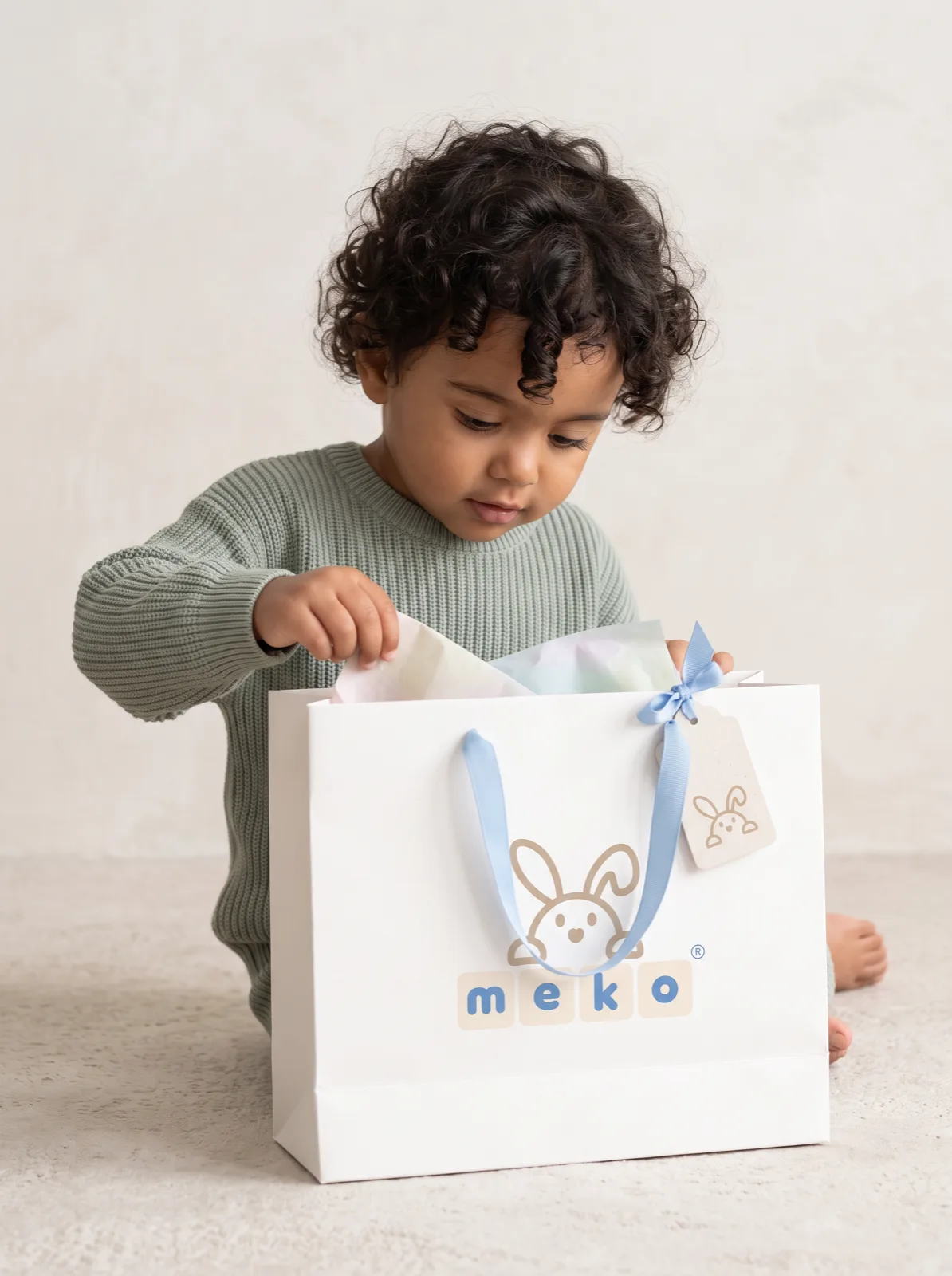
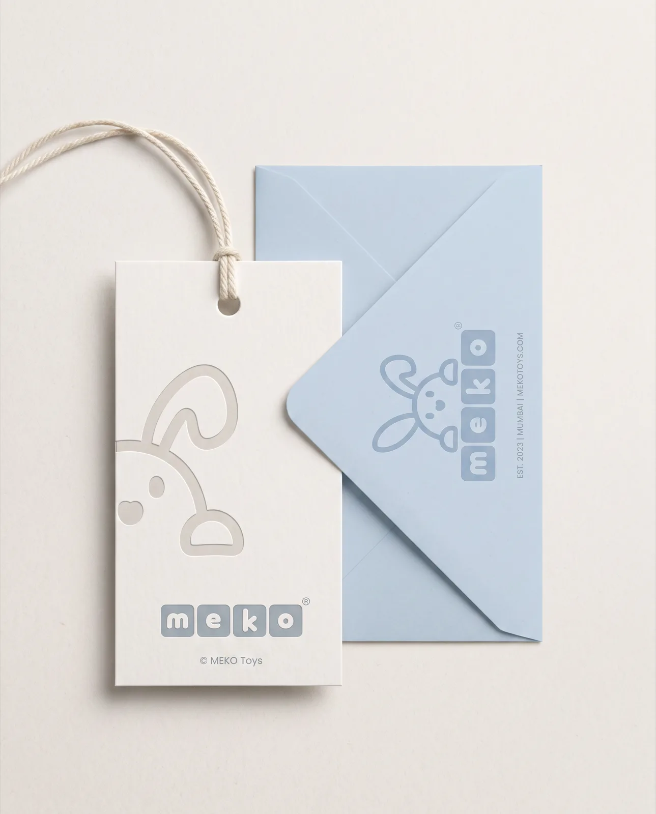
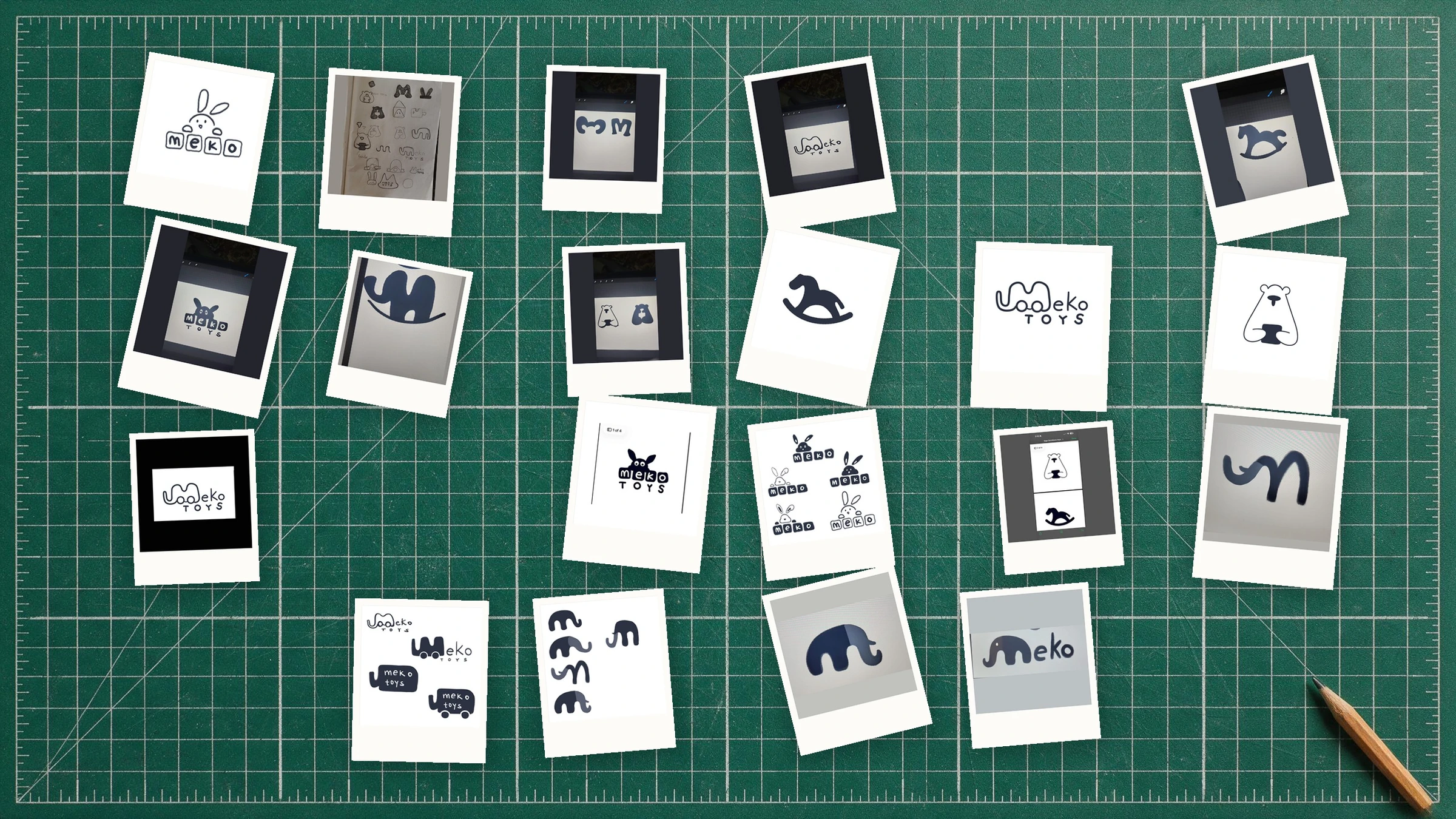
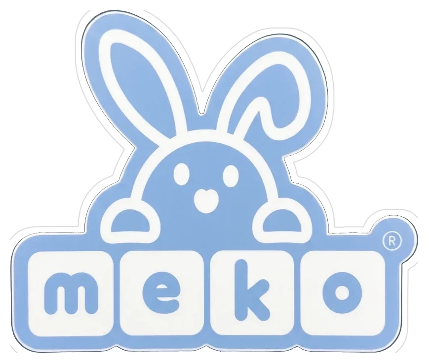
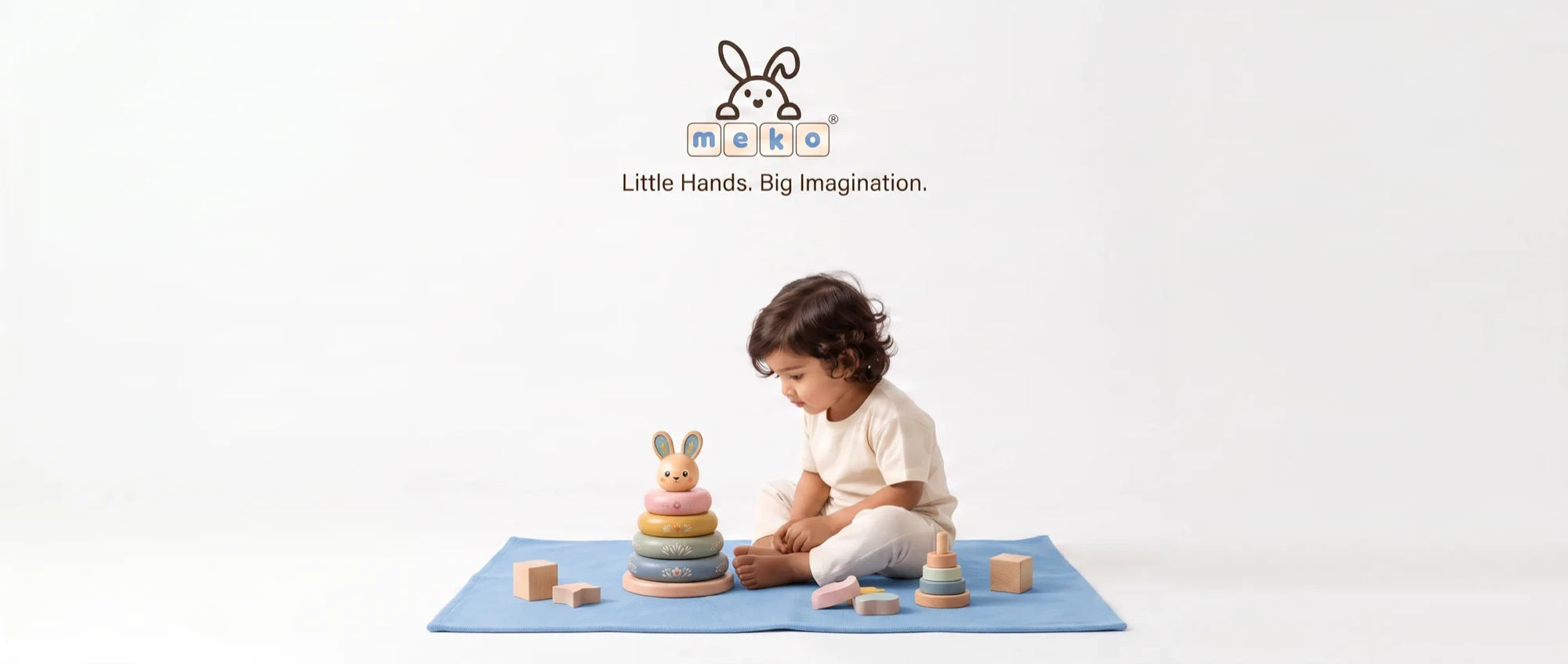
MEKO makes heirloom-grade wooden toys, and the brand had to feel the way the toys do in the hand: soft, rounded, warm, and built to be passed down. The mark is a rabbit peeking over four letter blocks. The logo is itself a toy, spelling the name the way a child would.
The palette stays out of the nursery-pink trap: a single cloud blue on cream, with the toys' own pastels doing the rest. It holds together from a blind-embossed hang tag to a printed envelope to a grosgrain ribbon on a gift bag.
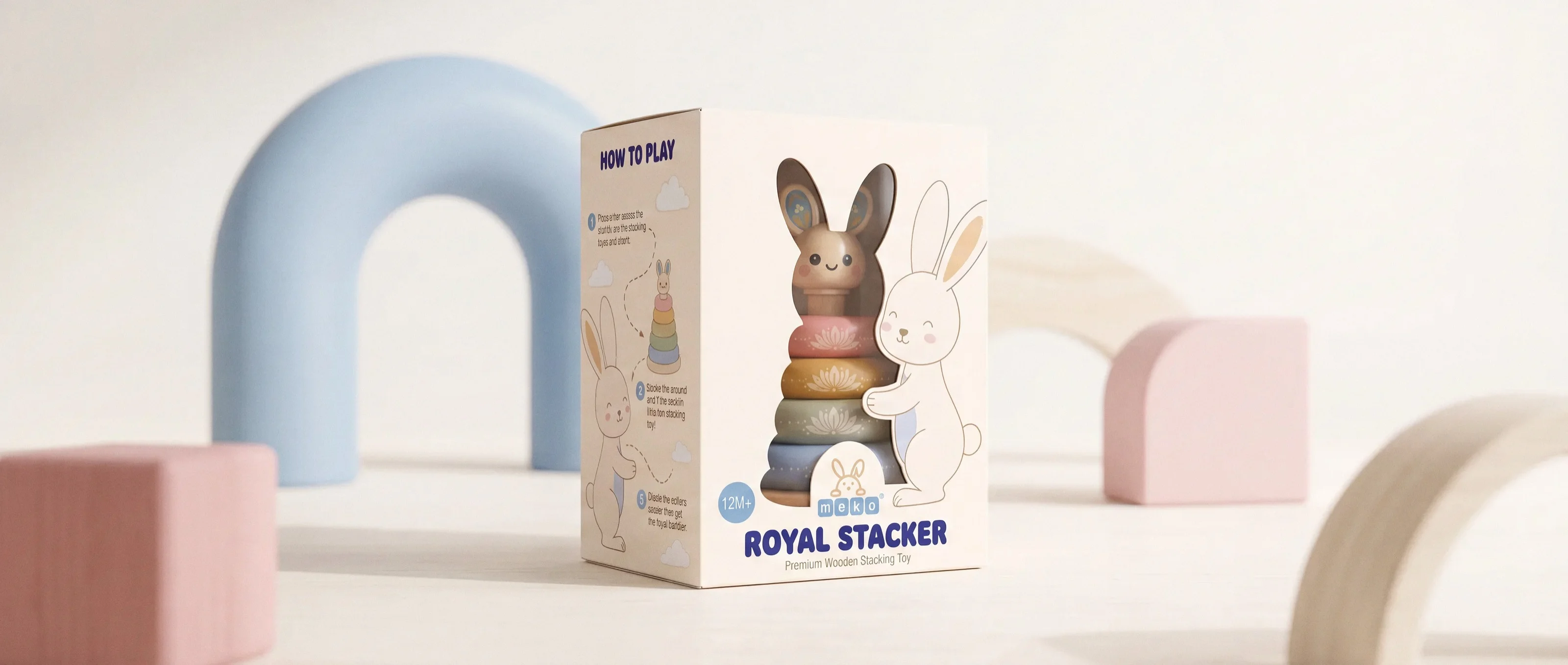
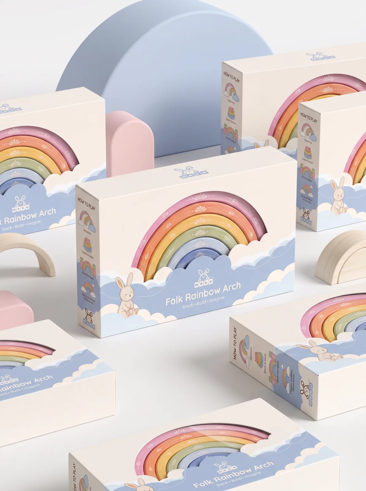
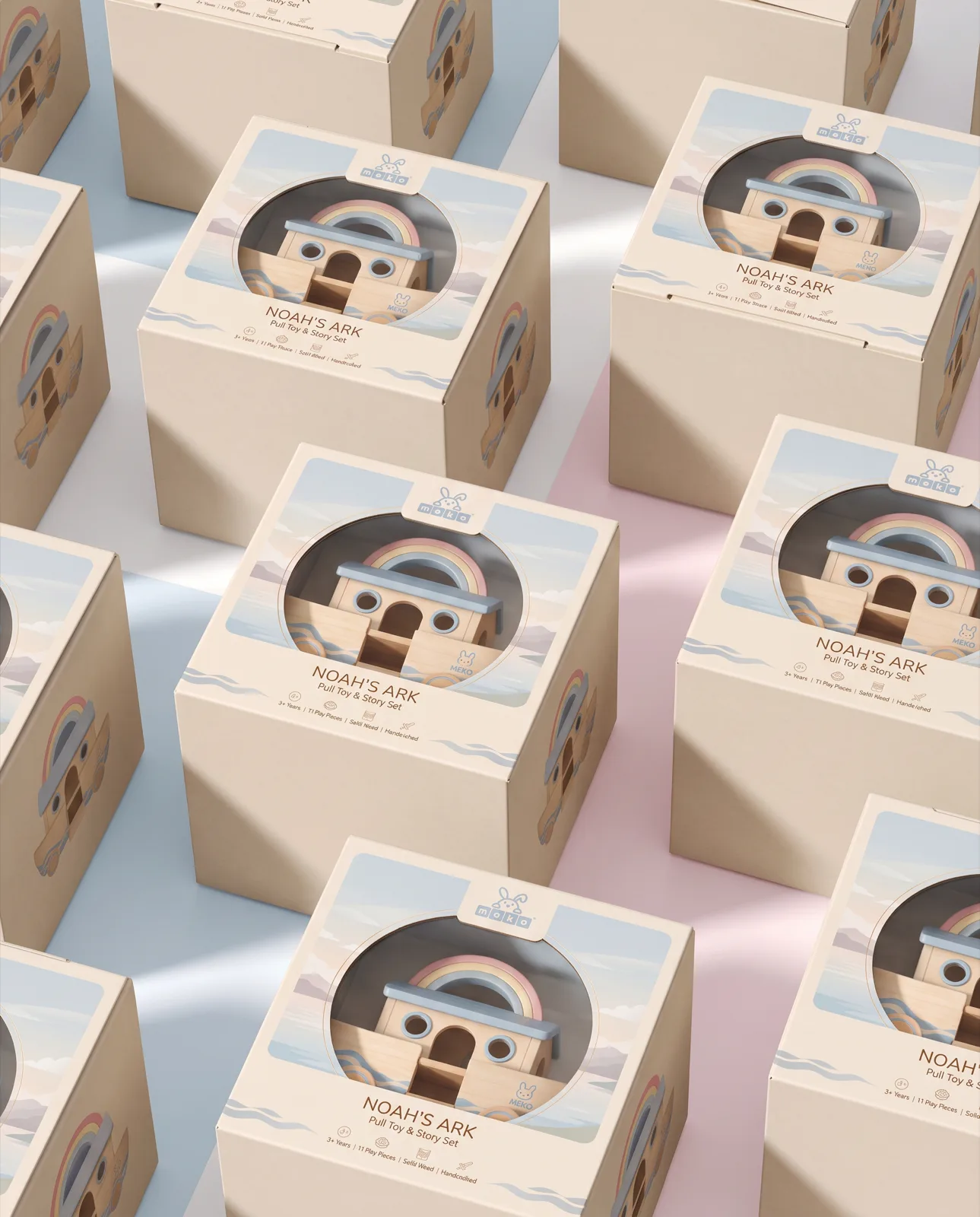
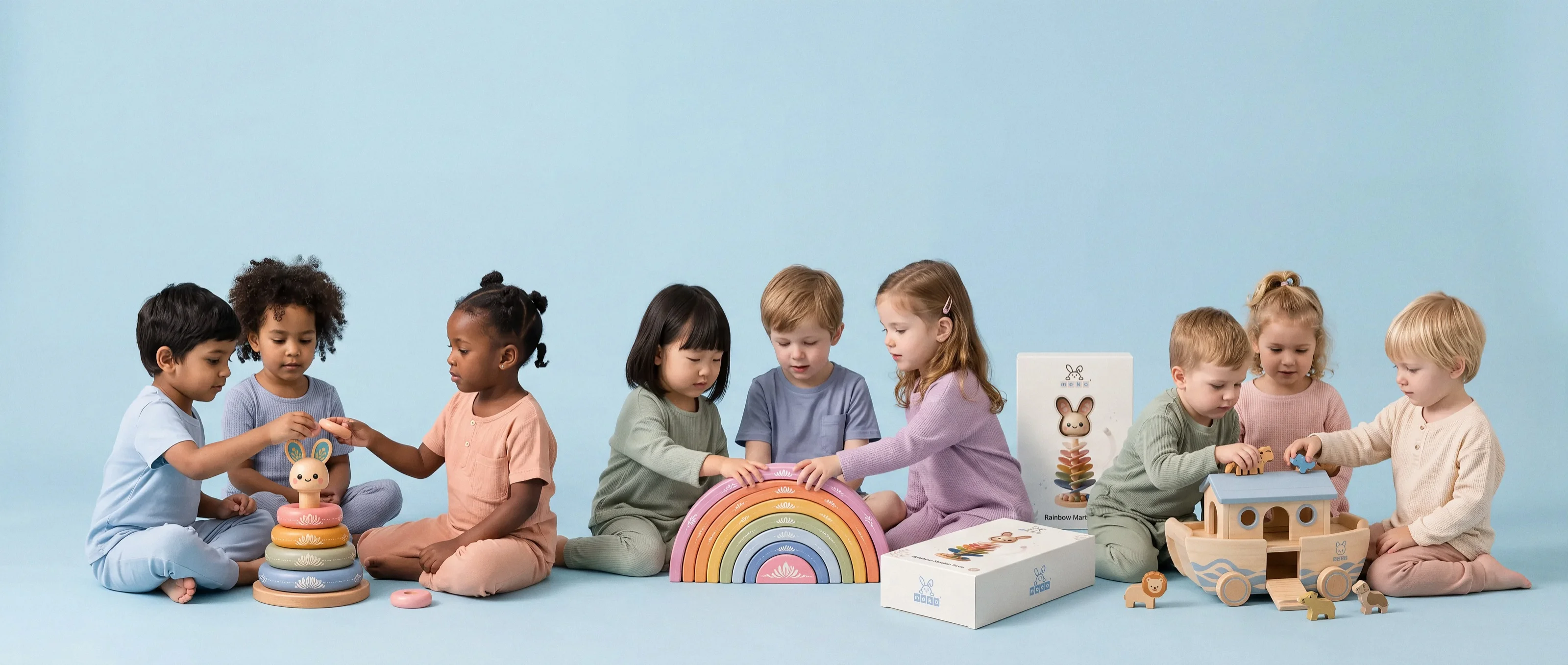
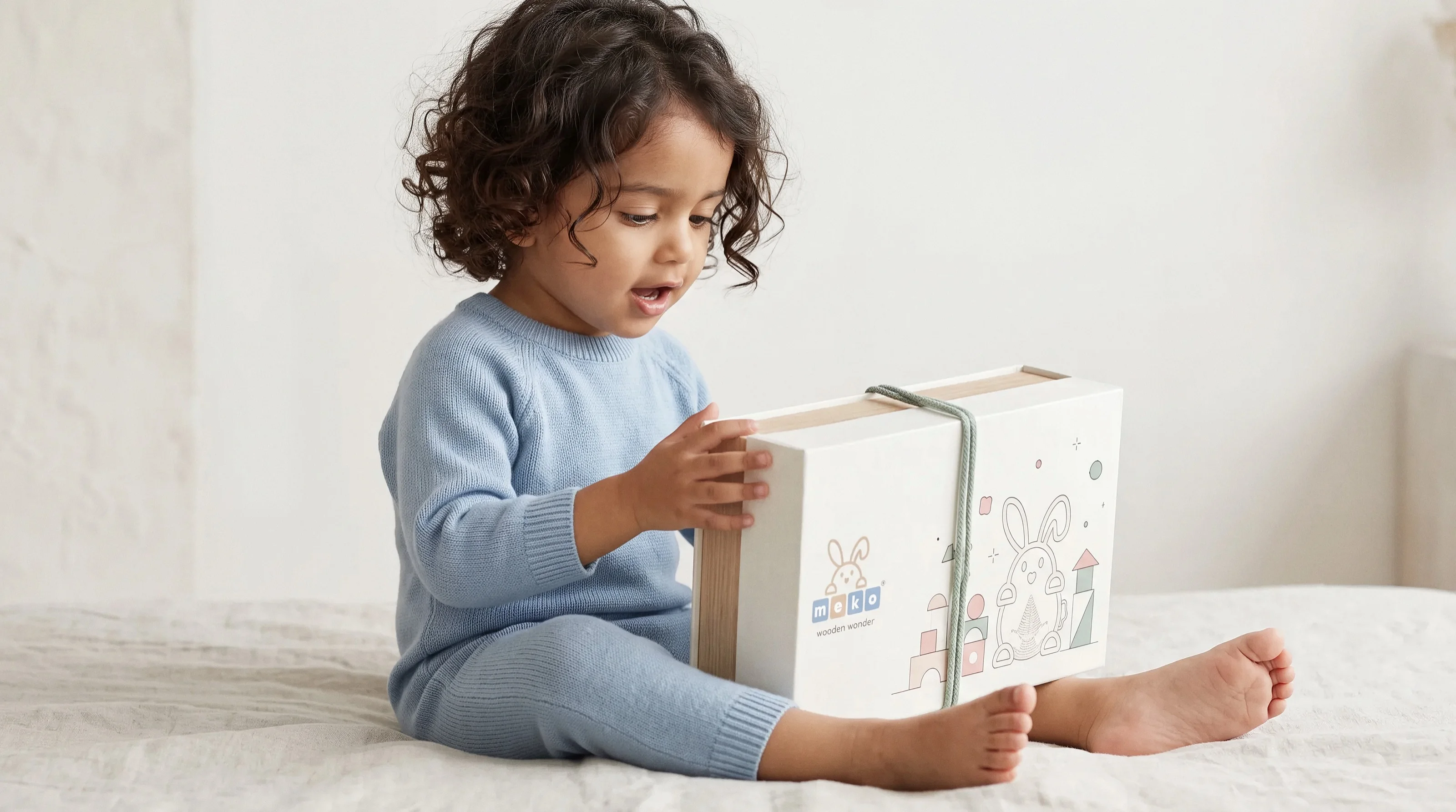
Packaging was built as a family, not a template. The Folk Rainbow Arch box die-cuts the clouds so the real rainbow rises through them; Noah's Ark peers out of a porthole window; the Royal Stacker's rabbit lines up nose-to-nose with an illustrated one holding the box. Every line carries the same how-to-play spine and the same quiet type.
The photography keeps the brand honest: real children, unposed, opening bags and stacking rings. The toys are the colour in every frame.
- Scope
- Brand identity, packaging system, art direction
- Deliverables
- Mark, three packaging lines, tags, stationery, gift bags, imagery
- Sector
- Children’s wooden toys
- Client
- Mumbai, est. 2023