loading
Pure A2 Milk
01 / About
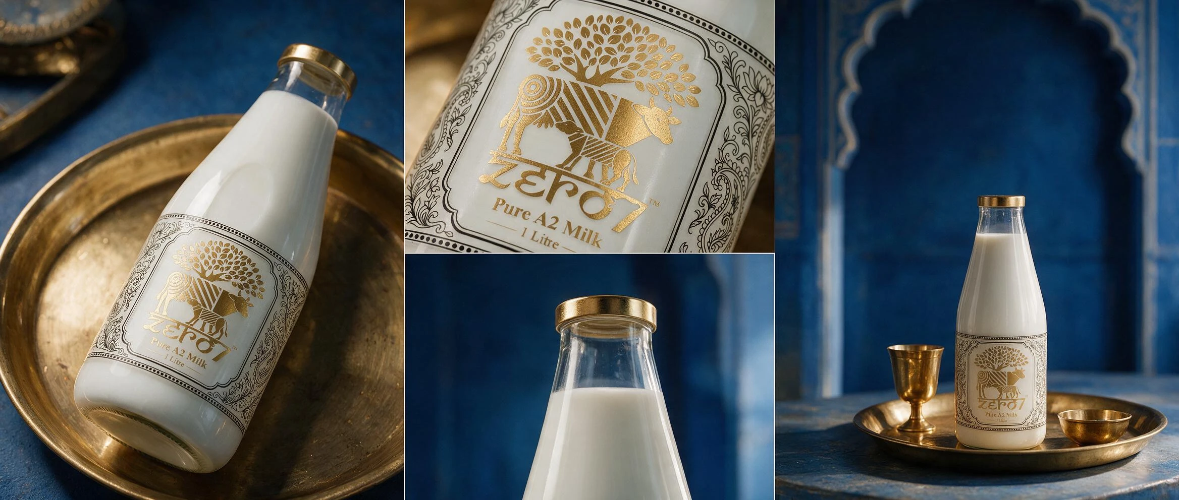
Fresh milk is sold on price and shelf life. zero7 is sold on provenance, so the pack had to do the opposite of what a dairy carton does: slow the shopper down rather than get out of their way.
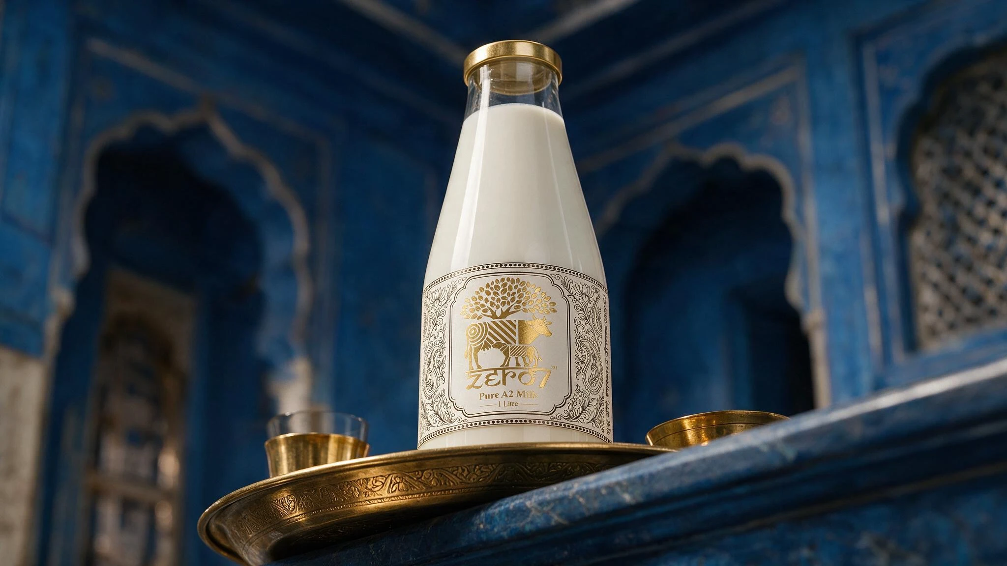
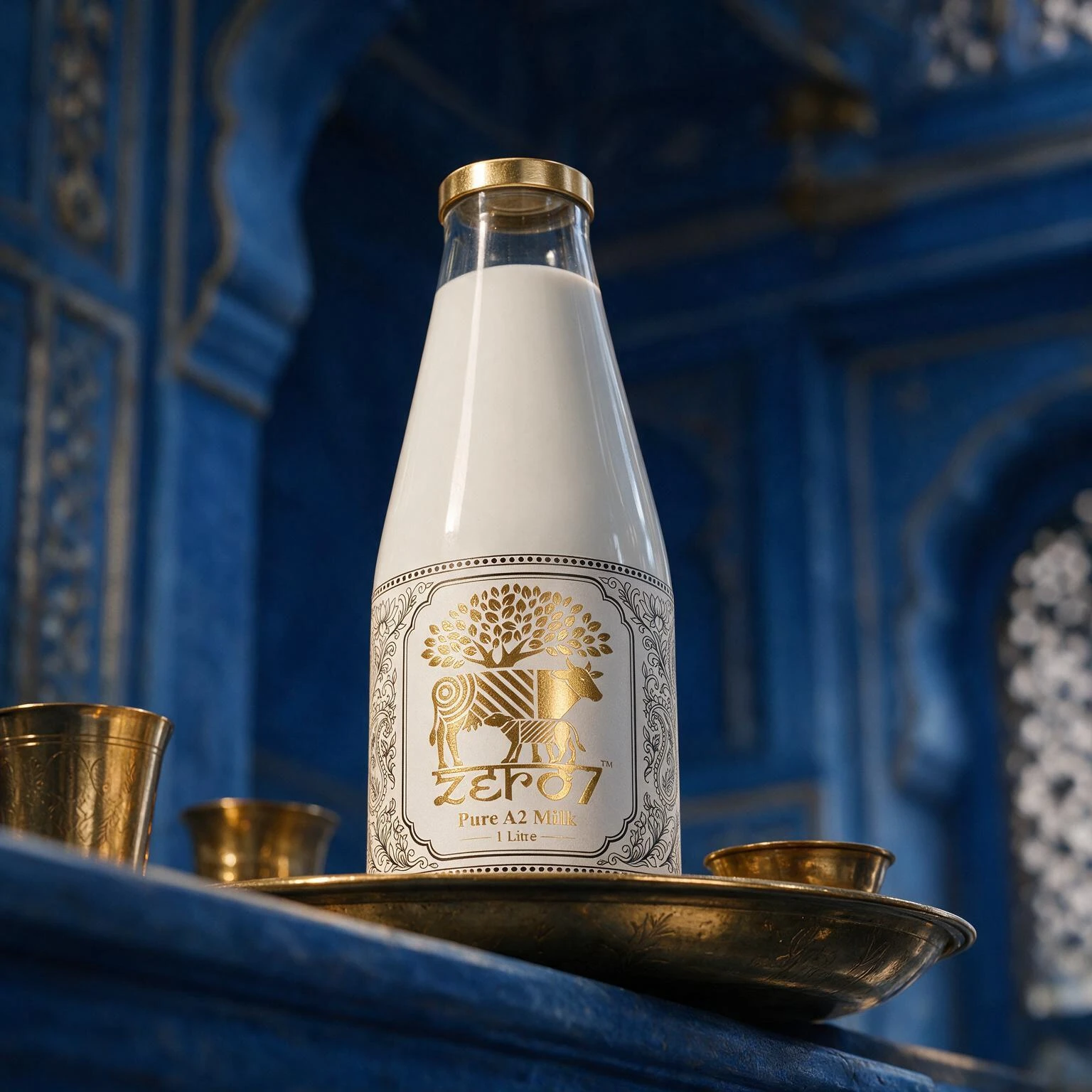
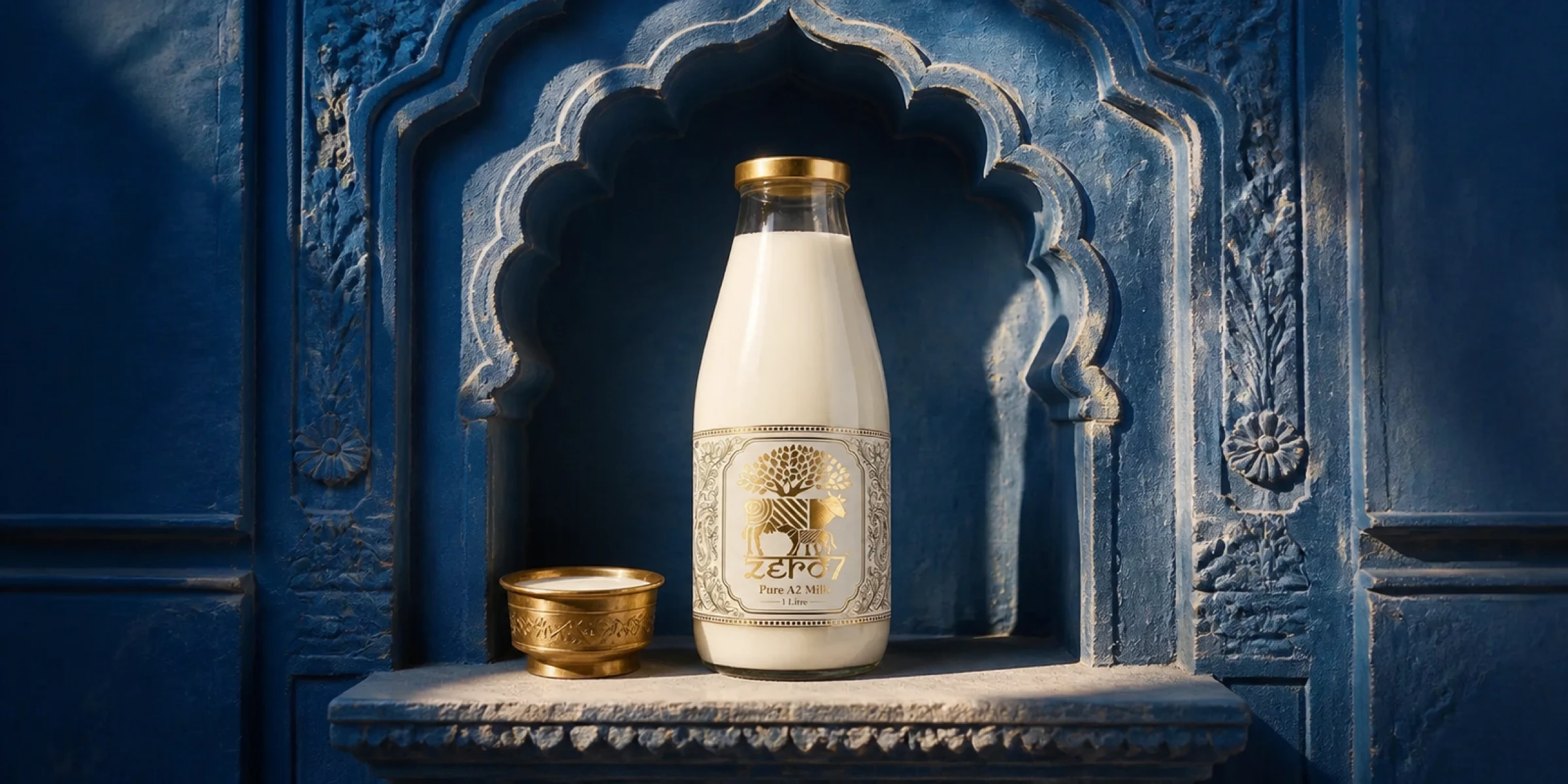
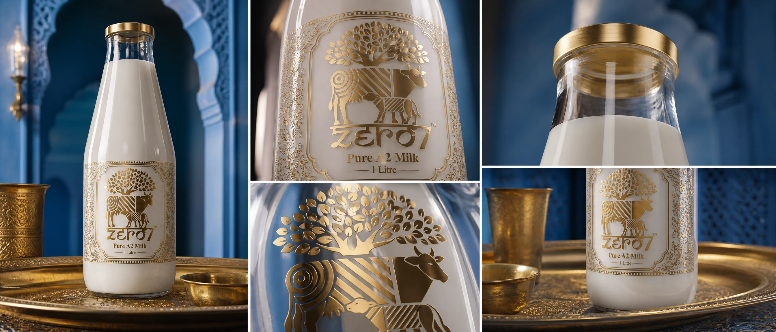
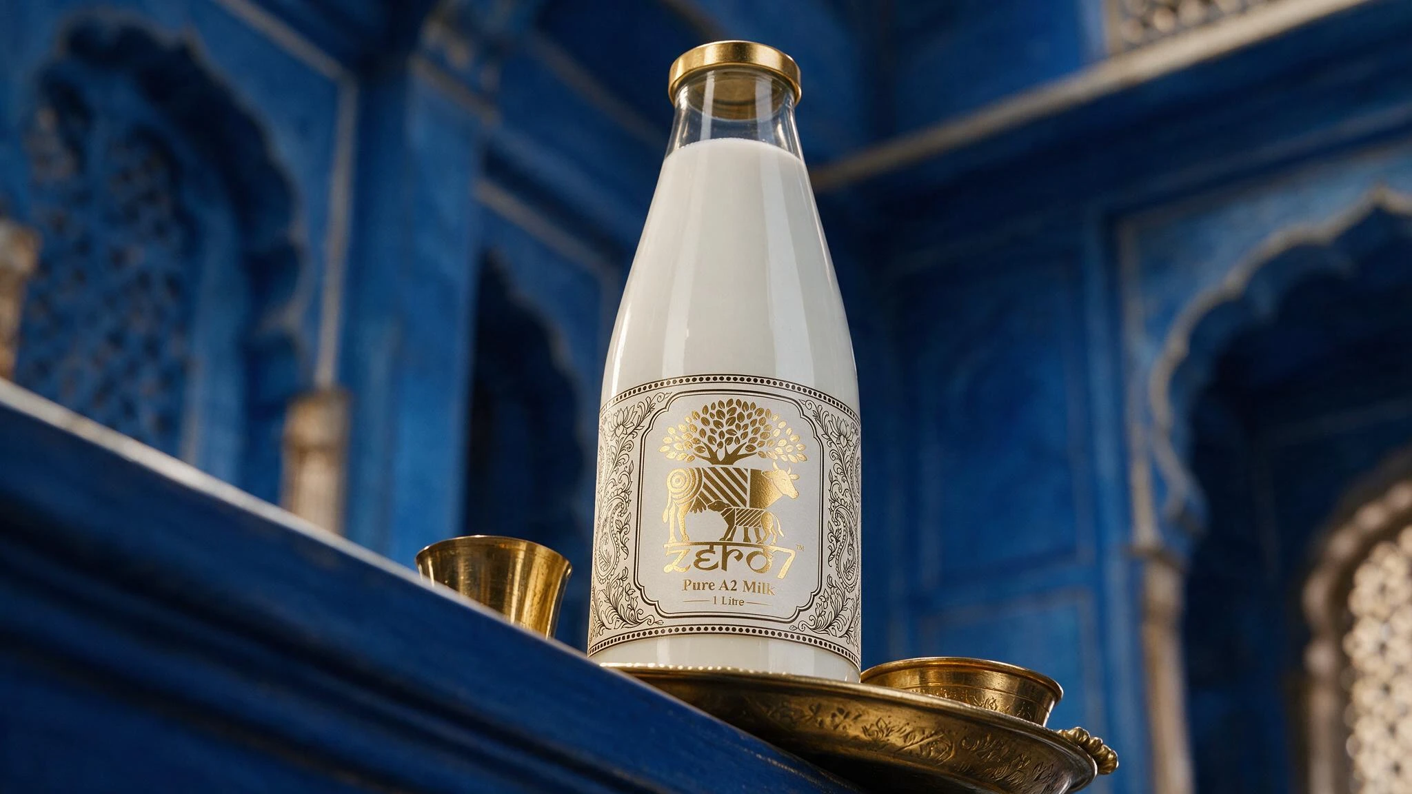
The label is a single engraved panel: a cow and her calf standing beneath a spreading tree, set inside a cusped arch lifted from temple facades, with paisley and lotus filigree running down either side. The animals are drawn in flat gold with the flanks broken into stripes and concentric rings, so the mark reads as ornament first and as livestock second.
Everything is gold foil on an uncoated cream, with the surrounding engraving blind-embossed rather than inked. That split is the whole trick: it puts the shine only where the story is, and leaves the rest to catch light at an angle, detail you find by handling the bottle, not by looking at a shelf.
Shot against the blue lime-washed walls and brass vessels the product is meant to sit among, because cream and gold on white says luxury generic; cream and gold against that blue says where it is from.
The system is documented where the client's team actually works: the full brand book ships as a password-gated website, with logos, colour, type and usage rules as living pages rather than a PDF. Print values sit pinned to every swatch, each rule names what it exists to prevent, and the whole thing is built to be run by people who were never in the room.
- Scope
- Packaging design, art direction, brand book site
- Deliverables
- Bottle label, foil and emboss spec, launch imagery, brand guidelines site
- Format
- 1 litre glass bottle
- Finish
- Gold foil with blind emboss on uncoated cream